
Selected projects
Our Work
Recent projects, from the first scope call through what changed after launch. Each one says what the client needed and what Brown Family Agency actually shipped.

Selected work
Six projects, six different problems.
These are placeholder visuals for the master template. In a produced build this grid holds real photography or screenshots from the projects it names.
Retail chain rebrand — new identity live across forty stores in six weeks. 
B2B SaaS marketing site — moved the demo signup off page four and onto the header. 
Direct-to-consumer storefront — checkout rebuilt to cut cart abandonment by a third. 
Product launch microsite — scoped, built, and live in eleven days. 
Editorial redesign — an ad-heavy layout replaced with one built around reading. 
Campaign microsite — a limited-run page that outlived its campaign and still converts.
Before and after
Drag the line to see what changed.
Each frame holds the page we were handed and the page we shipped. On a keyboard, tab to a frame and use the arrow keys.
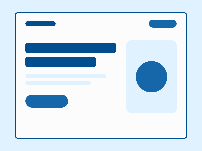
Retail chain home page 
SaaS pricing page
In their words
What the work actually changed.
A few notes from the people whose projects are on this page.
They rebuilt our checkout in three weeks, and cart abandonment dropped the same month it launched.
Elena Torres · VP Ecommerce, retail chain The demo signup used to live on page four. Now it is the first thing anyone sees, and our sales team noticed within a week.
Raj Malhotra · Head of Growth, SaaS company Eleven days before a launch event is not a normal timeline, and they hit it without cutting the parts that mattered.
Colin Marsh · Product Marketing Lead Readers stay on the page now instead of bouncing off the ad clutter. That was the whole point of the redesign.
Naomi Fischer · Editorial Director
Like what you see
Your project could be the next one on this page.
Tell us what you are building, and we will tell you honestly what it takes to launch it right.